There are still some qualifications floating out there. "They're probably forgeries." "They're most likely fakes." I'm gonna go out on a limb and say they are fakes. Start checking off the facts:
Months aren't spelled out on military memos; they use 3 letter abbreviations, yet August is spelled out.
One of the classes I teach is business writing, and as someone pointed out (and I agree), it seems unlikely for an order to be issued through a memo, especially one with no identifying features such as a letterhead.
The biggest issue for me is the document itself. Typewriters use what is called a fixed-with font, meaning each character takes up the same amount of space. Modern word processors adjust the kerning, or space between characters, to an optimum level, changing the space each character takes up. In 1972, it was extremely unlikely that the person typing this had access to any machine that could produce that latter kind of writing. A cybercast news service article claims at that time a machine of that type would cost upwards of $20,000. Here is one of the documents in question. One of the places kerning is noticeable is on the lower-case 'f' and 't'. For example, when a 't' is next to a shorter letter like an 'e' or 'o', the computer nudges them together to save space. You can see that in the memo.
In addition, this memo contains a superscript 'th' after the 111 under #2. There was no typewriter available at that time which did that.
And if all of this wasn't enough, Antimedia points out this gem from Powerline:
There are plenty of other pieces of evidence there for you to peruse; I won't bother listing them all. Clearly, these have been manufactured. The question is--by whom? And maybe more importantly, if a handful of bloggers with extra time on their hands spotted these fakes so quickly, why were CBS and the Boston Globe taken in so easily? Of course, that presupposes that they were actually taken in, doesn't it? The Globe has a history of hammering this issue nearly to death. Maybe they just didn't want to see the inconsistencies.UPDATE 12: In the August 18, 1973 memo "discovered" by 60 Minutes, Jerry Killian purportedly writes:Staudt has obviously pressured Hodges more about Bush. I'm having trouble running interference and doing my job.
But wait! Reader Amar Sarwal, citing Peter Nuss, points out that General Staudt, who thought very highly of Lt. Bush, retired in 1972.
I'm not suggesting that CBS or the Globe acted as agents for the Kerry campaign, but I will pose a hypothetical:
What would CBS and the Boston Globe be saying if the White House or the Swift Boat Veterans had produced documents critical of Kerry's record that later turned out to be forgeries?
P.S. What the Hell???? I keep losing posts. I've had to rewrite this thing three times already, including looking up all the links again. I thought this new design was supposed to solve problems. I'm encountering problems with this thing on a daily basis! Anyway, if it's less than perfect, forgive me. I got sick of reading and writing it.
UPDATE: (assuming I don't lose this as well) Just finished watching the "Nightline" bit on this. Amazing. I don't mean that in a good way. They said that "conservative websites" brought up "questions" on the documents, and that ABC had themselves consulted forensic experts. Those experts also had "questions" about the documents. But they never mentioned what those "questions" were other than that they "mostly had to do with typography." (okay, that's a paraphrase, but I bet it's close.) Then they put in a long quote from CBS saying that their (CBS's) experts had verified the documents and close friends of Killian had said the documents refected his thoughts and actions. They turned what should have been a scathing report on the inability of the media to fully verify these documents into a "he said/he said" piece. Like I said, amazing.
UPDATE #2: I've seen a couple of places on the web where people have insinuated that the Times New Roman font has been around since the 1930s, and that typewriters were able to do the things found in the memo, which would seem to contradict my points above. I would first note that common sense dictates that if a typewriter could make, say, a superscript 'th,' then one would use it throughout. Many of the memos use a "regular" sized th. Beyond that, one of the leading experts on these subjects seems to back the bloggers up. Also, the guy who runs the typewriter museum says there is no typewriter that he knows of that have all of the characteristics found in the memos, and that most of the ones that had one or two of the characteristics were expensive printing machines, not office equipment. I'm posting most of his page here, as he had to take down some of his site because of too many hits.
For those who want my opinion...the documents appear to be done in Word, and then copied repeatedly to make them "fuzzy". They use features that were not available on office typewriters the 1970s, specifically the combination of proportional spacing with superscript font. The IBM Executive has proportional spacing, but used fixed type bars. The Selectric has changeable type elements, but fixed spacing (some models could be selected at 10 or 12 pitch, but that's all). The Selectric Composer was not an office typewriter, but apparently did use proportional spacing. These were very expensive machines, used by printing offices, not administrative offices.
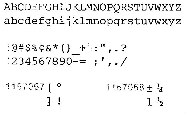
Here are scans of the Courier 12 font, and the Prestige Elite 72 font. Both were commonly used, and are sort of close to the font in the documents, but not quite. Notice that they are not proportionally spaced, so the typing looks very different from that on the memos. There is a superscript available for numbers, as used with footnotes, on the Symbol type balls. These balls were generally used for academics, such as preparing scientific and mathematical papers. I can find no "th" superscript in any of the IBM literature I have.
These are scans from a mid-1970s IBM Selectric Typewriter Type Styles brochure, IBM publication G542-0053-7, which does not appear to be explicitly copywrited.
update: I dragged my Executive up from the basement, it's not working too well...but I did type some of the 19 may 72 memo. It doesn't fit on the page using a real vintage proportional spacing typewriter...and it looks different.
At least my low opinion of TV news remains intact.
No comments:
Post a Comment